Introduction
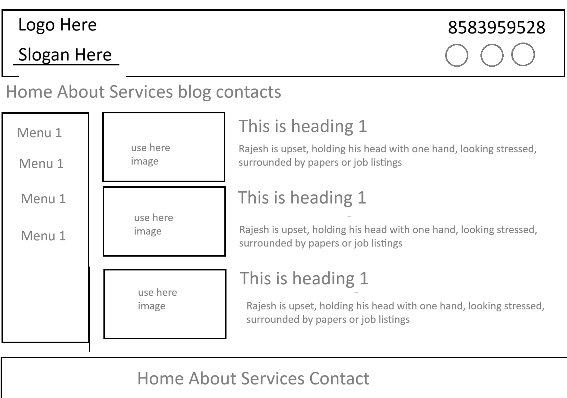
Creating a responsive and user-friendly website is essential in today’s digital era. A well-structured webpage ensures that users can easily navigate through content while maintaining an aesthetically pleasing layout. This webpage design focuses on simplicity and accessibility, incorporating a structured navigation menu, a sidebar for additional menu options, and a main content area featuring images and text. The goal is to provide an efficient layout suitable for blogs, business websites, or personal portfolios. By implementing responsive media queries, the webpage adapts seamlessly across different screen sizes, ensuring an optimal user experience on desktops, tablets, and smartphones.
Design
Code:
<!DOCTYPE html>
<html lang="en">
<head>
    <meta charset="UTF-8">
    <meta name="viewport" content="width=device-width, initial-scale=1.0">
    <title>Responsive Webpage</title>
    <style>
        * {
            margin: 0;
            padding: 0;
            box-sizing: border-box;
            font-family: Arial, sans-serif;
        }

        .header {
            display: flex;
            justify-content: space-between;
            align-items: center;
            padding: 20px;
            border: 2px solid black;
        }

        .logo {
            font-size: 24px;
            font-weight: bold;
        }

        .slogan {
            font-size: 18px;
            font-weight: bold;
            text-decoration: underline;
        }

        .contact {
            font-size: 20px;
        }

        .nav {
            display: flex;
            justify-content: center;
            padding: 10px;
            background: #f0f0f0;
        }

        .nav a {
            margin: 0 15px;
            text-decoration: none;
            color: gray;
            font-size: 18px;
        }

        .container {
            display: flex;
            padding: 20px;
        }

        .sidebar {
            width: 20%;
        }

        .sidebar a {
            display: block;
            padding: 10px;
            background: #f0f0f0;
            margin-bottom: 10px;
            text-decoration: none;
            color: gray;
            text-align: center;
        }

        .content {
            width: 80%;
            display: flex;
            flex-wrap: wrap;
        }

        .box {
            width: 45%;
            margin: 2.5%;
            padding: 10px;
            border: 1px solid black;
            display: flex;
        }

        .image {
            width: 40%;
            height: 100px;
            background: #ddd;
            display: flex;
            align-items: center;
            justify-content: center;
            margin-right: 10px;
        }

        .text {
            width: 60%;
        }

        .footer {
            text-align: center;
            padding: 15px;
            background: #f0f0f0;
            margin-top: 20px;
            font-size: 18px;
        }

        /* Responsive Media Query */
        @media (max-width: 768px) {
            .container {
                flex-direction: column;
            }

            .sidebar, .content {
                width: 100%;
            }

            .box {
                width: 100%;
                flex-direction: column;
            }

            .image {
                width: 100%;
                height: 150px;
            }
        }
    </style>
</head>
<body>
    <header class="header">
        <div>
            <div class="logo">Logo Here</div>
            <div class="slogan">Slogan Here</div>
        </div>
        <div class="contact">8583959528</div>
    </header>

    <nav class="nav">
        <a href="#">Home</a>
        <a href="#">About</a>
        <a href="#">Services</a>
        <a href="#">Blog</a>
        <a href="#">Contacts</a>
    </nav>

    <div class="container">
        <aside class="sidebar">
            <a href="#">Menu 1</a>
            <a href="#">Menu 1</a>
            <a href="#">Menu 1</a>
            <a href="#">Menu 1</a>
        </aside>
        <section class="content">
            <div class="box">
                <div class="image">Use Here Image</div>
                <div class="text">
                    <h2>This is heading 1</h2>
                    <p>Rajesh is upset, holding his head with one hand, looking stressed, surrounded by papers or job listings.</p>
                </div>
            </div>
        </section>
    </div>

    <footer class="footer">Home About Services Contact</footer>
</body>
</html>