Creating a Responsive Login Form with ReactJS and CSS
Are you new to ReactJS and eager to build something practical and straightforward? Crafting a login form is an excellent way to get hands-on experience with ReactJS and CSS. This project will introduce you to core concepts such as components, state management, and styling, all while creating a functional and visually appealing login interface.
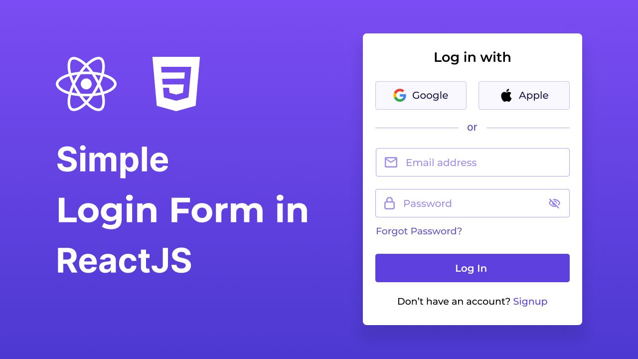
In this blog post, I’ll walk you through the process of creating a Responsive Login Form using ReactJS and CSS. Our form will feature essential elements such as email and password fields, a toggle for showing and hiding the password, and options for social logins with Google and Apple.
By following this guide, you’ll gain insights into managing form states, implementing user-friendly features, and styling your components to achieve a sleek and responsive design. Ready to dive in? Let’s get started!
Setting Up the Project
Before we begin creating the responsive login form with ReactJS and CSS, ensure that Node.js is installed on your computer. If you haven’t installed it yet, you can download and set it up from the official Node.js website.
Create a Project Folder
1. Create a new folder, such as `login-form`.
2. Open this folder in your VS Code editor.
Initialize the Project
1. Open your terminal by pressing `Ctrl + J`.
2. Use Vite to create a new React app with the following command:
npm create vite@latest ./ -- --template react
Install the required dependencies and start the development server by running:
npm install
npm run dev
If your project is running smoothly in your browser, congratulations! You’ve successfully set up your project. Now, let’s move on to the next steps: modifying folders and files.
Modify Folders and CSS Files
1. **Remove Default Assets:**
– Delete the default `assets` folder and the `App.css` file from your project.
2. **Add Logos:**
– Download the SVG logo files and place them directly into your `public` folder. Ensure that only the SVG files are included, and avoid adding the entire logos folder.
3. **Update CSS:**
– Replace the content of `index.css` with the provided CSS code.
/* Importing Google Fonts - Montserrat */
@import url('https://fonts.googleapis.com/css2?family=Montserrat:ital,wght@0,100..900;1,100..900&display=swap');

* {
  margin: 0;
  padding: 0;
  box-sizing: border-box;
  font-family: "Montserrat", sans-serif;
}

body {
  display: flex;
  align-items: center;
  justify-content: center;
  min-height: 100vh;
  background: #5F41E4;
}

#root {
  width: 100%;
  padding: 0.6rem;
}

.login-container {
  margin: 0 auto;
  max-width: 410px;
  padding: 2rem 1.5rem;
  border-radius: 0.5rem;
  background: #fff;
  box-shadow: 0 10px 20px rgba(0, 0, 0, 0.1);
}

.login-container .form-title {
  text-align: center;
  font-size: 1.37rem;
  font-weight: 600;
  margin-bottom: 1.87rem;
}

.login-container .social-login {
  display: flex;
  gap: 1.31rem;
}

.social-login .social-button {
  display: flex;
  gap: 0.81rem;
  width: 100%;
  font-size: 1rem;
  font-weight: 500;
  cursor: pointer;
  padding: 0.75rem 0;
  border-radius: 0.31rem;
  align-items: center;
  justify-content: center;
  background: #F9F8FF;
  border: 1px solid #D5CBFF;
  transition: 0.3s ease;
}

.social-login .social-button:hover {
  border-color: #5F41E4;
  background: #f1eff9;
}

.social-login .social-button .social-icon {
  width: 23px;
}

.login-container .separator {
  position: relative;
  margin: 1.5rem 0;
  text-align: center;
  background: #fff;
}

.login-container .separator span {
  z-index: 1;
  font-weight: 500;
  color: #6652BE;
  position: relative;
  background: #fff;
  font-size: 1.06rem;
  padding: 0 0.9rem;
}

.login-container .separator::after {
  content: "";
  position: absolute;
  left: 0;
  top: 50%;
  height: 1px;
  width: 100%;
  background: #bfb3f2;
}

.login-form .input-wrapper {
  height: 54px;
  width: 100%;
  position: relative;
  margin-bottom: 1.5rem;
}

.login-form .input-field {
  width: 100%;
  height: 100%;
  outline: none;
  font-size: 1.06rem;
  border-radius: 0.31rem;
  border: 1px solid #bfb3f2;
  padding: 0px 1.25rem 0 3.12rem;
  transition: 0.2s ease;
}

.login-form .input-field:focus {
  border-color: #5F41E4;
}

.login-form .input-field::placeholder {
  color: #9284c8;
}

.login-form .input-wrapper i {
  position: absolute;
  top: 50%;
  height: 100%;
  display: flex;
  color: #a395e0;
  align-items: center;
  transform: translateY(-50%);
  transition: 0.2s ease;
}

.login-form .input-wrapper i:not(.eye-icon) {
  left: 0.93rem;
  pointer-events: none;
}

.login-form .input-field:focus ~ i:not(.eye-icon) {
  color: #5F41E4;
}

.login-form .input-wrapper i.eye-icon {
  display: none;
  right: 0.93rem;
  color: #917DE8;
  cursor: pointer;
  font-size: 1.25rem;
}

.login-form .input-wrapper .input-field:valid ~ .eye-icon {
  display: flex;
}

.login-form .forgot-password-link {
  display: block;
  width:fit-content;
  margin-top: -0.44rem;
}

.login-form .login-button {
  border: none;
  outline: none;
  width: 100%;
  height: 54px;
  color: #fff;
  font-size: 1.125rem;
  font-weight: 500;
  cursor: pointer;
  margin-top: 2.19rem;
  border-radius: 0.31rem;
  background: #5F41E4;
  transition: 0.3s ease;
}

.login-form .login-button:hover {
  background: #4320df;
}

.login-container .signup-prompt {
  text-align: center;
  font-size: 1.06rem;
  font-weight: 500;
  margin: 1.75rem 0 0.31rem;
}

.login-container a {
  color: #5F41E4;
  font-weight: 500;
  text-decoration: none;
}

.login-container a:hover {
  text-decoration: underline;
}
Creating the Components
- Organize Your Files:
- Within the
srcdirectory of your project, create acomponentsfolder.
- Within the
- Create Component Files:
- Inside the
componentsfolder, create the following files:SocialLogin.jsxInputField.jsx
- Inside the
Adding the Code
- SocialLogin Component:
Open components/SocialLogin.jsx and insert the code to render social login buttons for Google and Apple.
const SocialLogin = () => {
  return (
    <div className="social-login">
      <button className="social-button">
        <img src="google.svg" alt="Google" className="social-icon" />
        Google
      </button>
      <button className="social-button">
        <img src="apple.svg" alt="Apple" className="social-icon" />
        Apple
      </button>
    </div>
  )
}

export default SocialLogin;
In components/InputField.jsx, add code to handle both email and password fields, including functionality to toggle password visibility.
import { useState } from "react";

const InputField = ({ type, placeholder, icon }) => {
  // State to toggle password visibility
  const [isPasswordShown, setIsPasswordShown] = useState(false);

  return (
    <div className="input-wrapper">
      <input
        type={isPasswordShown ? 'text' : type}
        placeholder={placeholder}
        className="input-field"
        required
      />
      <i className="material-symbols-rounded">{icon}</i>
      {type === 'password' && (
        <i onClick={() => setIsPasswordShown(prevState => !prevState)} className="material-symbols-rounded eye-icon">
          {isPasswordShown ? 'visibility' : 'visibility_off'}
        </i>
      )}
    </div>
  )
}

export default InputField;
Finally, update the src/App.jsx file with the provided code to import and utilize the components, thereby completing your login form.
import SocialLogin from "./components/SocialLogin";
import InputField from "./components/InputField";
const App = () => {
return (
<div className="login-container">
<h2 className="form-title">Log in with</h2>
<SocialLogin />
<p className="separator"><span>or</span></p>
<form action="#" className="login-form">
<InputField type="email" placeholder="Email address" icon="mail" />
<InputField type="password" placeholder="Password" icon="lock" />
<a href="#" className="forgot-password-link">Forgot password?</a>
<button type="submit" className="login-button">Log In</button>
</form>
<p className="signup-prompt">
Don't have an account? <a href="#" className="signup-link">Sign up</a>
</p>
</div>
)
}
export default App;
That’s it! If you’ve followed all the steps, you should now see your Login Form project in your browser. Test it out by entering an email and password, toggling the password visibility, and exploring the social login options.
Conclusion
Congratulations! You’ve successfully built a functional and stylish login form using ReactJS and CSS. This project has given you hands-on experience with managing form states, adding user-friendly features, and applying CSS for a polished look.
But this is just the beginning! You might consider enhancing your form with additional features or integrating it with a backend for real-world applications. For more inspiration, check out other login form templates available on this website.
If you encounter any issues while working on your ReactJS login form, you can download the source code files for this project for free by clicking the “Download” button. You can also view a live demo by clicking the “View Live” button.
Once you’ve downloaded the project, be sure to review the `README.md` file included in the zip for detailed instructions on how to set up and run the project.