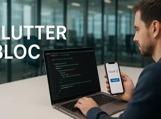
📱 Flutter Responsive UI: A Complete Guide with MediaQuery, LayoutBuilder, and Full Code
In today’s multi-device world, responsive UI is a must. Whether your Flutter app runs on a small phone, a large tablet, or a desktop screen, your interface should adapt seamlessly. In this blog, you’ll learn how to build responsive layouts in Flutter using MediaQuery, LayoutBuilder, and other techniques—all with full working examples.
🧠 Why Responsive UI Matters
Flutter apps can target:
- Smartphones 📱
- Tablets and iPads 💊
- Desktops and laptops 💻
- Web browsers 🌐
If your layout isn’t responsive, your app might look broken or cramped on different screens. This blog will ensure your design works everywhere.
🚀 What You’ll Learn
- ✅ What is responsive UI in Flutter
- ✅ When to use
MediaQueryvsLayoutBuilder - ✅ Full responsive login page with code
- ✅ How to test responsiveness on web & desktop
- ✅ Bonus tips for advanced responsiveness
📦 Tools & Setup
No need for third-party packages! We’ll use built-in tools:
MediaQueryLayoutBuilderFlexible,ExpandedOrientationBuilder(bonus)
flutter config --enable-web
flutter config --enable-windows-desktop
flutter config --enable-macos-desktop
📱 Part 1: Responsive Layout Using MediaQuery
MediaQuery gives you access to the device’s screen size, orientation, and padding. Let’s use it to create a smart responsive layout.
🧩 Full Example: Responsive UI with MediaQuery
import 'package:flutter/material.dart';

void main() => runApp(const MyApp());

class MyApp extends StatelessWidget {
  const MyApp({super.key});

  @override
  Widget build(BuildContext context) {
    return MaterialApp(
      title: 'MediaQuery Example',
      theme: ThemeData(primarySwatch: Colors.indigo),
      home: const MediaQueryResponsivePage(),
    );
  }
}

class MediaQueryResponsivePage extends StatelessWidget {
  const MediaQueryResponsivePage({super.key});

  @override
  Widget build(BuildContext context) {
    final screenWidth = MediaQuery.of(context).size.width;
    final screenHeight = MediaQuery.of(context).size.height;
    final isSmallScreen = screenWidth < 600;

    final titleFontSize = isSmallScreen ? 24.0 : 36.0;
    final textFontSize = isSmallScreen ? 14.0 : 18.0;
    final padding = isSmallScreen ? 16.0 : 40.0;

    return Scaffold(
      appBar: AppBar(
        title: const Text("MediaQuery Responsive"),
      ),
      body: Padding(
        padding: EdgeInsets.all(padding),
        child: Center(
          child: Column(
            mainAxisAlignment: MainAxisAlignment.center,
            children: [
              Text("Welcome",
                  style: TextStyle(
                      fontSize: titleFontSize, fontWeight: FontWeight.bold)),
              const SizedBox(height: 20),
              Text(
                "Screen Width: ${screenWidth.toStringAsFixed(0)} px\n"
                "Screen Height: ${screenHeight.toStringAsFixed(0)} px",
                style: TextStyle(fontSize: textFontSize),
                textAlign: TextAlign.center,
              ),
              const SizedBox(height: 30),
              Container(
                width: isSmallScreen ? screenWidth * 0.8 : screenWidth * 0.4,
                padding: const EdgeInsets.all(16),
                color: Colors.indigo.shade100,
                child: Text(
                  "This container adjusts its size using MediaQuery.",
                  style: TextStyle(fontSize: textFontSize),
                  textAlign: TextAlign.center,
                ),
              ),
            ],
          ),
        ),
      ),
    );
  }
}
💻 Part 2: Responsive Layout with LayoutBuilder
LayoutBuilder helps render widgets based on the available space. This is perfect for multi-device login forms and reusable components.
🧱 Full Example: Login UI with LayoutBuilder
class ResponsiveLayout extends StatelessWidget {
  const ResponsiveLayout({super.key});

  @override
  Widget build(BuildContext context) {
    return Scaffold(
      body: LayoutBuilder(
        builder: (context, constraints) {
          if (constraints.maxWidth < 600) {
            return const MobileLogin();
          } else {
            return const TabletDesktopLogin();
          }
        },
      ),
    );
  }
}

class MobileLogin extends StatelessWidget {
  const MobileLogin({super.key});

  @override
  Widget build(BuildContext context) {
    return Center(
      child: Padding(
        padding: const EdgeInsets.all(20),
        child: Column(
          mainAxisAlignment: MainAxisAlignment.center,
          children: const [
            Text("Login", style: TextStyle(fontSize: 28)),
            SizedBox(height: 20),
            TextField(decoration: InputDecoration(labelText: "Email")),
            SizedBox(height: 10),
            TextField(obscureText: true, decoration: InputDecoration(labelText: "Password")),
            SizedBox(height: 20),
            ElevatedButton(onPressed: null, child: Text("Login")),
          ],
        ),
      ),
    );
  }
}

class TabletDesktopLogin extends StatelessWidget {
  const TabletDesktopLogin({super.key});

  @override
  Widget build(BuildContext context) {
    return Center(
      child: Row(
        children: [
          Expanded(child: Image.asset('assets/login_illustration.png', height: 300)),
          Expanded(
            child: Padding(
              padding: const EdgeInsets.all(40),
              child: Column(
                mainAxisAlignment: MainAxisAlignment.center,
                children: const [
                  Text("Login", style: TextStyle(fontSize: 36)),
                  SizedBox(height: 20),
                  TextField(decoration: InputDecoration(labelText: "Email")),
                  SizedBox(height: 10),
                  TextField(obscureText: true, decoration: InputDecoration(labelText: "Password")),
                  SizedBox(height: 20),
                  ElevatedButton(onPressed: null, child: Text("Login")),
                ],
              ),
            ),
          ),
        ],
      ),
    );
  }
}
🧪 How to Test Responsiveness
✅ On Web
flutter run -d chrome- Resize the browser window manually
- Or open Chrome DevTools → Toggle Device Toolbar → Simulate devices
✅ On Desktop
flutter run -d windows # or macos / linuxDrag to resize the desktop app window and observe layout changes.
✅ When to Use MediaQuery vs LayoutBuilder in Flutter
🟦 Use MediaQuery When You Need Global Screen Information
Use MediaQuery to access information about the entire screen such as width, height, orientation, and system padding (status bar, notch, etc.). It’s perfect for applying global UI adjustments.
✅ Example Use Cases:
- Adjust font size based on screen width
- Apply padding/margins dynamically
- Scale widgets proportionally
double width = MediaQuery.of(context).size.width;
bool isMobile = width < 600;
🟩 Use LayoutBuilder When You Need Widget-Specific Constraints
Use LayoutBuilder when you want to make layout decisions based on the constraints of the parent widget. It’s ideal for creating responsive or reusable components inside flexible containers.
✅ Example Use Cases:
- Switch between Column and Row layouts based on width
- Build responsive cards, grids, or sidebars
- Hide elements when space is too small
LayoutBuilder(
  builder: (context, constraints) {
    if (constraints.maxWidth < 600) {
      return MobileLayout();
    } else {
      return DesktopLayout();
    }
  },
);
🎯 Quick Summary
| Use Case | MediaQuery |
LayoutBuilder |
|---|---|---|
| Get full screen size | ✅ Yes | ❌ No |
| Check parent widget size | ❌ No | ✅ Yes |
| Orientation or safe padding | ✅ Yes | ❌ No |
| Modular/responsive components | ⚠️ Sometimes | ✅ Best |
| Layout switching (column ↔ row) | ✅ Global | ✅ Local (better) |
💡 Best Practice:
Use MediaQuery for screen-aware logic, and LayoutBuilder for container-aware layout building.
📱 Common Device Width Breakpoints
| Device Type | Screen Width Range (in logical pixels) |
|---|---|
| Small Phones | < 360 |
| Medium Phones | 360 – 399 |
| Large Phones | 400 – 479 |
| Small Tablets | 480 – 599 |
| Tablets (Portrait) | 600 – 719 |
| Tablets (Landscape) | 720 – 1023 |
| Small Desktop | 1024 – 1439 |
| Large Desktop | ≥ 1440 |
Note: These values are logical pixels, not actual device pixels (Flutter handles scaling).
🧠 Example: MediaQuery in Flutter
double screenWidth = MediaQuery.of(context).size.width;

if (screenWidth < 360) {
  print("Small phone layout");
} else if (screenWidth < 600) {
  print("Phone layout");
} else if (screenWidth < 1024) {
  print("Tablet layout");
} else {
  print("Desktop layout");
}
🛠 Tip: Use LayoutBuilder for More Control
LayoutBuilder(
  builder: (context, constraints) {
    if (constraints.maxWidth < 600) {
      return PhoneLayout();
    } else if (constraints.maxWidth < 1024) {
      return TabletLayout();
    } else {
      return DesktopLayout();
    }
  },
)
🧰 Bonus Tips
- Use
OrientationBuilderto switch layouts in portrait vs landscape - Use
FlexibleandExpandedto fill space smartly - Wrap content in
FittedBoxto auto-scale - Use
AspectRatiofor perfect widget proportions
📚 Conclusion
Building responsive apps in Flutter is easier than ever with MediaQuery and LayoutBuilder. Start with these built-in tools and add third-party libraries like flutter_screenutil or responsive_framework later as needed.
🔗 What’s Next?
In the next tutorial, we’ll build a Responsive Admin Dashboard in Flutter with sidebars, tabs, and charts. Stay tuned!